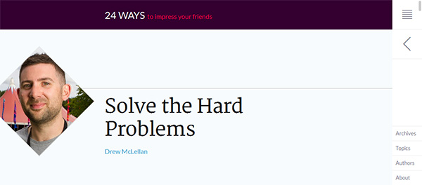
Shaping up profile pictures

,
Rectangles. The web is full of rectangles. We all know why, of course. The default shape for elements on the web is a rectangle, and until recently, that's all we had. As CSS gradually introduces more and more capabilities, though, web designers have increasingly fewer excuses to stick to default shapes. In this post, I'd like to look at how 24 Ways uses a non-traditional rhombus shape to distinguish author portraits in its article headers.
Marking things up
Let's take a look at the HTML here:
<span class="avatar">
	<img class="article_image u-photo"
		src="//cloud.24ways.org/authors/drewmclellan280.jpg"
		width="160" height="160"
		alt="Drew McLellan" />
</span><!-- .avatar -->
The important thing is that the img element appears inside a container, in this case a span with the class of avatar. As we'll see, the technique depends on having a container which is rotated independently of the image.
Scale the image up
Before we rotate the image, we want to scale it a little. Why? If the image is rotated at its original size, it won't reach the edges of the diamond shape and we'll see white triangles where the image is too small (Figure 2, right). By making the image bigger, it will reach the corners (left).
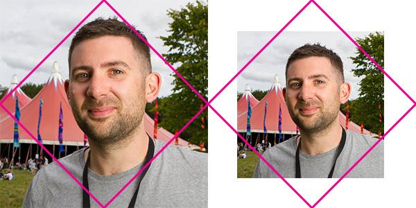
By how much do we need to increase it? A little secondary school maths will help. The width and height of the scaled image need to be equal to the diagonal of the original image. If the original image had a width and height of 1, we know from Pythagoras (a² + b² = c²) that the diagonal would be equal to:
1² + 1² = c²
⇒ c = √(1² + 1²)
⇒ c = √2 = 1.4142135623731
Hence, we need to scale the image up by 41.42135…%, or about 50% if we're playing fast and loose with our measurements. There are a couple of ways to do this in CSS. The first would be to add transform: scale(1.5, 1.5), which increases the size by 50%. We could then add transform-origin: 50% 50% to make sure that it expands from the centre. Instead of that, 24 Ways went in another direction. In order to scale it, they increased the width of the image to 150% and set the height to auto. To keep it centred, they set margins to -25%. I'm not sure why they went with width instead of transform; maybe it's because transforms don't have such wide support (IE8 and Opera Mini, not mentioning any names). So here's our CSS so far:
.avatar img {
	width: 150%;
	height: auto;
	margin: -25%;
}Rotate the container
The containing element for the image is a <span> element, so the first thing we need to do is set it to display: block. This will cause the <span> to stretch out to the width of its container. Next, we want to make sure that when the image is rotated, the corners are not visible. We do this with overflow: hidden. Then, we rotate it using transform: rotate(45deg). To make sure that the element is tranformed from the centre rather than a corner, we add transform-origin: 50% 50%. Here's the CSS in full:
.avatar {
	display: block;
	overflow: hidden;
	-webkit-transform: rotate(45deg);
	-ms-transform: rotate(45deg);
	transform: rotate(45deg);
	-webkit-transform-origin: 50% 50%;
	-ms-transform-origin: 50% 50%;
	transform-origin: 50% 50%;
}
This is the result:
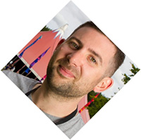
transform: rotate(45deg) gets us this far, but we're not done yet.Rotate the image
The final step is to rotate the img inside span.avatar. We rotated the container by 45°, so in order to return the image to an upright position, we rotate it by -45°.
.avatar img {
	margin: -25%;
	width: 150%;
	height: auto;
	-webkit-transform: rotate(-45deg);
	-ms-transform: rotate(-45deg);
	transform: rotate(-45deg);
}
If 24 Ways had wanted the whole rhombus shape to appear on screen, they might have added a margin to the left of the container. This margin would need to be the difference between half the diagonal length of the image and half the horizontal width, multiplied by the width of the image, or:
((½ × √2) - (½ × 1)) × 160px
= (½ × (√2 - 1)) × 160px
≅ 20% × 160px
= 32px
Instead of this, 24 Ways simply allows the left corner of the rhombus to disappear off screen, leaving a much more interesting five-sided shape.
Skip to navigationConclusion
If everything on the web is a rectangle, how are our users going to know what's important? By changing the shape of elements — in this case, the profile picture of an article's author — we can not only make our web pages look more interesting, but we can highlight the most important points (what language teachers call input enhancement). In the case of 24 Ways, they're emphasising those hard-working authors who've agreed to write an article for us in the pre-Christmas madness, instead of drinking eggnog and singing ‘Jingle Bells’ with the rest of their colleagues. Adding interesting shapes to elements is not, in my opinion, simply a designery flourish, but an important way of helping users to access and process the information they've come to us to obtain.
Skip to navigationFurther resources
For more creative ways to use CSS shapes, I strongly recommend CSS Secrets (2015) by Lea Verou. You might also like to listen to Jen Simmons and Eva Ferreia discussing CSS transforms on episode 117 of the Web Ahead (June 2016).
Skip to navigation Skip to navigation
Comments
comments powered by Disqus