Responsive images, Part 1—Masthead

,
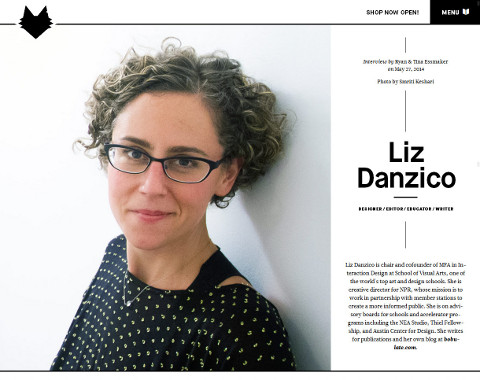
Images on TGD, or at least on the Liz Danzico page, seem to come in three fruity flavours: the masthead at the top of the page, large images and small images. Each type of image does different things at different screen widths, so it's hard to describe in brief terms how each image type behaves. In this post, I'll look at the “story” of the masthead, and what happens as the screen widens.
At small widths the masthead spans the screen, but is then squeezed to about two-thirds of the screen width past 1220px. At this point, the masthead text is shifted to the right of the image. Furthermore, at smaller sizes the image gets slightly cropped, then expands to full size as the browser window gets wider.

Masthead Markup
So, how it this achieved? The markup in HTML for the masthead image is:
<img src="liz-danzico-smriti-keshari-sm.jpg"
    sizes="100vw, (min-width: 40em) 80vw"
    srcset="liz-danzico-smriti-keshari-sm.jpg 400w,
            liz-danzico-smriti-keshari-med.jpg 800w,
            liz-danzico-smriti-keshari-lg.jpg 1200w,
            liz-danzico-smriti-keshari-xl.jpg 1800w"
    alt="Liz Danzico" class="ri">
I'm familiar with your basic src, alt, height and width attributes, but what's going on here? Well, it's a bit complicated, but here are a few resources that describe how to achieve responsive images:
- Picturefill: A responsive image polyfill (Scott Jehl)
- The new srcset and sizes explained (Martin Wolf)
- Picturefill 2.0: Responsive Images And The Perfect Polyfill (Tim Wright)
- Videocast: Figuring Responsive Images (Chris Coyier)
- Podcast: The Big Web Show #118, 20 May 2014 (Scott Jehl)
In a nutshell, responsive images enable your device to download an image at a sensible size, rather than having to download the same massive image regardless of device size. So, at wide screen widths, which you᾿re more likely to find on a hard-wired PC, you can instruct the browser to download an XXL image. On the other hand, at smaller screen widths, which you᾿ll more likely find on a device connected via mobile data, you can tell the browser to bring up a smaller image. When you compare the size of the Picturefill JS file (19KB) with the difference between the size of the smallest image (around 100KB) and the largest (around 500KB), the extra code seems worth it. For the time being, Scott Jehl's polyfill can be used to handle responsive images, and it works as follows:
- Add the responsive image polyfill to your HTML document's
<head>section (the following links to the polyfill JavaScript file, the code for which I copied from the Scott Jehl site above and pasted into a new text file called picturefill.js):<script type="text/javascript" src="picturefill.js"></script> - Take a full-size picture and scale it down using photo editing software. Export it to JPG at various size increments. TGD used the following: extra large 2000 x 1600px, large 1500 x 1200px, medium 1100 x 880px, small 800 x 640px. Note that these sizes all have the same proportions.
- Choose your size increments. On the TGD site, the designer set the image to
width: 100%in the style sheet, and then set thesrcsetincrements (400w, 800w, ...) to change at about 50% of the width of the JPG file. For example, although liz-danzico-smriti-keshari-sm.jpg is 800px wide, the image swaps out at 400px. So essentially, the designer lied about the image width. Presumably, this is to make sure that the image is never scaled to be larger than its actual size (e.g. on a retina display), as this might lead to nasty pixelated poop. Kids, sometimes it's OK to lie. - Include the
sizesattribute, even though I have no idea what it does. I tried testing it, but I couldn't see any difference.
Update 04/11/2014: I should note that since I started writing about TGD, they've changed the code for their images. They now use the <picture> element with attributes that are similar-but-different to the markup above. Scott Jehl discusses <picture> at around 15:00 in this interview: The Big Web Show #118. I might deal with this in a later post. I guess the reason for having a polyfill is that it is meant to work only until the official HTML5 solution is adopted by all browsers. Seriously, this is my first taste of how quickly things move in the world of web design. Unbelievable!
This article on A List Apart expands on how to use the <picture> element: Responsive images in practice.
I wanted to look at the CSS that controls the positioning of the header text in relation to the masthead image. However, I can't quite see from TGD's CSS how exactly it works. Curse my limited CSS skills!
Skip to navigationA Jolly Good Cropping
At smaller sizes, the masthead image seems to get cropped a little bit. Looking at the CSS, I think this is the responsible markup:
article header.hero img {
  width:90%;
  display:block;
  margin-left:-10%;
}
However, when I test it the results are a bit weird. I can get it to behave in a more similar way to the actual behaviour of the website with this:
article header.hero img {
  width:120%;
  display:block;
  margin-left:-10%;
}
When the screen width exceeds 1220px, the image is “uncropped” thanks to this media query:
@media (max-width: 1220px) {
  article header.hero img {
    width:100%;
    margin:0
  }
}
So, that's how the masthead works in TGD. There are some interesting tips that I've picked up here:
- I can use Scott Jehl's picturefill.js polyfill to make large images more bandwidth-friendly.
- I can make picturefill seamless by proportionately scaling down a large photo in photo editing software and exporting it at a few different sizes, then tell the browser which image to download at which browser width using
srcset. - By adjusting margins and image width in CSS and media queries, I can give the illusion of an image being cropped without having to edit it.
Next, I'll look at how the other two image types work, and also how they get the loader image to appear
Skip to navigation
Comments
comments powered by Disqus