Establishing typographic hierarchy

,
Tags: Typography
Up to now, I᾿ve tended to make my own type decisions according to whatever typeface I᾿m into at the time, but I᾿m sure professional designers base their decisions on firmer foundations. Bearing in mind the web design credentials of A List Apart, I᾿m going to take a punt and say that none of the type on an article like Susan Robertson᾿s CSS Audits: Taking Stock of Your Code was put there by accident. In the next couple of posts, I᾿m going to consider the typography on ALA and see what lessons are contained within. For this post, I᾿ve got three questions to answer: What is typographical hierarchy? What are some of the tricks for establishing hierarchy? And which ones does ALA employ?
Skip to navigationWhat is hierarchy?
Well, it may seem like an obvious question, but I᾿d like to start by defining what exactly we mean when we talk about ‘hierarchy’ within a text. In Type on Screen (2014), p68, Ellen Lupton refers to a text᾿s hierarchy as “the ranked structure of parts within a whole”, while John Kane in A Type Primer, Second Ed. (2013), p146, describes it as ranking the different kinds of information in a text “according to levels of importance”. So, the writer and/or designer needs to go through a process of analysing the text and deciding how different parts relate to the text that immediately follows, and to text in other parts of the document. In a web context, this basically means using heading tags: <h1>, <h2> and <h3> (Kane, p132, points out that not many texts will need to go deeper than <h3>), and making sure that they contrast sufficiently with paragraph text and with each other.
How is hierarchy built?
So, now that we have an idea of what hierarchy is, what practical steps should a web designer take to create a clear and beautiful hierarchy?
Contrast
In A Type Primer, Kane says that contrast is a key tool in establishing hierarchy. He lists a few different ways of creating typographic contrast (p62), which include contrasting:
- light/bold (for more on this see Five simple steps to better typography, Part 5)
- condensed/extended
- organic/machined
- roman (or straight)/italic
- small/large (see Five simple steps to better typography, Part 4)
- positive/negative (see Five simple steps to better typography, Part 1)
- serif/sans serif
- ornate/simple type
To this list, you could also add:
- normal text vs all caps vs small caps (p132)
- text of different colours
- horizontal/diagonal/vertical text vs text along a path
With all of these, the magic of good design, I suppose, is to find the combination of these levers to support both the structure and the content of the text.
Skip to navigationDistinction and Harmony
Jason Santa Maria, in On Web Typography (2014), p78, elaborates on the idea of contrast. He suggests that if designers wish to use contrasting typefaces, they should limit themselves to two, and that these should be chosen according to their distinction and harmony. Distinction is achieved by selecting typefaces that have differences in their structure, such as x-height and stroke contrast. On the other hand, harmony is achieved by selecting typefaces with inherent visual relationships. For example, you can choose two typefaces that are based on the same geometric principles, are from the same superfamily or were created by the same typographer. Finally, you can create harmony by simply choosing fonts out of the same family, and just varying the weights and widths.
Skip to navigationWhitespace
Kane (p148) also illustrates how playing with whitespace can allude to hierarchy. Depending on the level, you can either include or omit whitespace between a heading and body text. You can even have no space at all, by having headings appear inline with the body text, or take a heading out of the flow of the text by exdenting it.
Skip to navigationPublishing Staples
Finally, Jeffrey Zeldman in Designing with Web Standards, Third Edition (2010), p268 and Mandy Brown in In Defence of Readers suggest using familiar publishing staples to guide the reader, such as oversized text in opening paragraphs, pull quotes, initial caps (see CSS Tricks), and so on.
Skip to navigationTypographical Hierarchy in A List Apart
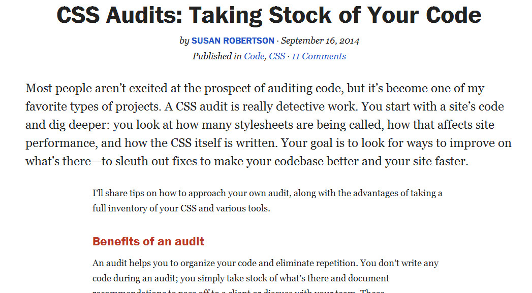
The next step is to have a look at A List Apart and see how it builds its hierarchy according to the above guidelines. I can identify at least 20 different typographical regions on the page for Susan Robertson᾿s CSS Audits: Taking Stock of Your Code. These range from the website banner right at the top to the headings, the main article copy and the “About the author” section at the bottom.
The main way that hierarchy is established is through contrast. First of all, it is supported through type size. From the giant website banner at the top, through the article header, the subheadings, the paragraphs and the additional info sections, the type size varies sufficiently to guide but not lose or overwhelm the reader. Secondly, two typefaces are paired: Georgia for the paragraphs and Franklin ITC for the headings. Finally, the <h2> and <h3> headings are distinguished from each other by their colour and by the letterform (Title case vs ALL CAPS; see Figure 1).
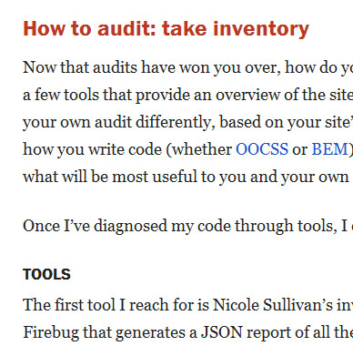
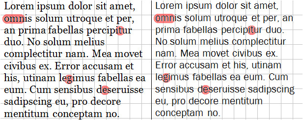
<h2> and <h3> working togetherI᾿d say that both dissonance and harmony are achieved in the two typefaces. Franklin has a slightly greater x-height than Georgia, giving it a blockier, more functional feel, while Georgia is squatter with its wider letterforms, especially on letters like m, n and o, and its thicker strokes make it look darker. On the other hand, many letterforms across the two faces are similar: the gs both have a decorative ear and a fully closed loop, and apart from the x-height, the e and t are very close in appearance (see Figure 2).
ALA makes use of whitespace to support hierarchy. First of all, <h2> elements are surrounded by more space than other elements (see Figure 3), giving them more status without being too distracting. There is less space between <h3> and subsequent elements, which again reinforces the relative importance.
.main-content > h2 {
    margin-top: 36px;
    margin-bottom: 12px
}

.main-content > h3 {
    margin-bottom: 3px
}<h2> and <h3> elementsFinally, in terms of publishing staples, ALA᾿s first paragraph is set in larger text than the rest of the article, giving it a little introductory fanfare (see Figure 4).
My initial reaction when I looked at the typography on ALA was, “Georgia…really?”. To me, it seemed like such a humdrum typeface — it᾿s available on most devices manufactured in the last 5–10 years, and, like, it᾿s so 2010. When I think about it, though, it makes sense. The guys at ALA have made some great decisions regarding line height and font size, and they᾿ve partnered Georgia beautifully with Franklin ITC. Also, the fact that it᾿s preloaded onto most machines means that there should be fewer calls to Typekit or other font providers. Regarding headings, I᾿ve learnt a lot about pulling typographical levers to create contrast, and I think ALA has done a nice job of ensuring that their headings are clear and distinct but not in your face. I wasn᾿t sure about the brick-red colour on the <h2>s, but now I see the same colour cropping up in other areas of the page, so I guess it works. All in all, I᾿d say I᾿m a fan of the way ALA has created a consistent hierarchy in it᾿s articles.
Conclusion
Building hierarchy into a website is crucially important, but with a bewildering number of ways to do it, I think it᾿s important to study existing websites. I᾿m hoping that, now I᾿ve looked closely at one site, ALA, I᾿ll be more keenly aware of hierarchy, and be able to apply it effectively in my own websites.
Skip to navigation
Comments
comments powered by Disqus