Type as navigation

,
Tags: Typography
Like the captain of a ship, the reader of a webpage needs some help to figure out where she is, where she᾿s been and where she᾿s going next, along with the tools to get there. For me at least, that᾿s what navigation means. In this, my second blog post about A List Apart, I look at best practice for navigation, I reflect on how ALA does it, and I see what tips, tricks, dos and don᾿ts I can glean.
Skip to navigationTop Tips for Navigation
For this post, I᾿ve consulted a number of sources for advice on building in clear navigation:
- 10 Principles Of Navigation Design And Why Quality Navigation Is So Critical (onextrapixel.com)
- The Principles of Good Web Design Part 2: Navigation (inspectelement.com)
- 22 Principles Of Good Website Navigation and Usability (swimbi.com)
- Type on Screen, Ellen Lupton (2014), p106, “Type as Navigation”
- net magazine, issue 260 (November 2014), p56, “Off-Canvas Navigation”
- Finally, this has some interesting examples of beautiful navigation to admire and investigate: 25 beautiful & inspiring navigation menus
In the sections that follow, I᾿ll summarise the main points. Many of them are common sense, but there are a few gems hidden away. I divide them into four general sections: user expectations, traceability, accessibility and content support.
Skip to navigationUser Expectations
With the internet being around for 20 years or so, we as users have come to expect websites to behave in certain ways. Familiar patterns include a horizontal menu near the top of the page and/or a vertical menu down the left-hand side, links that are styled in a particular way (blue, underlined, purple for visited links), and so on. Newer innovations, such as the hamburger menu, are still gaining traction. Here are some pointers from the above sources:
- Navigation should be comfortable, unobtrusive, and simple.
- Sites should meet the expectations of the average web user, for example, with the familiar ‘Home’, ‘About’ and ‘Contact Us’ pages.
- Navigation should have consistent classification and consistent graphical styling across all pages within the site.
- Navigation should avoid unfamiliar patterns and gimmicks.
- Homepage navigation, in particular, should provide context—some clue as to the content that a link leads to.
- Put the most important links towards the beginning and end of a list.
- Navigation should let readers know if they are visiting an external site, or if the link involves downloading a PDF or other file type (two helpful tricks: CSS External Link Images and Signify “PDF Bombs”).
Traceability
Traceability means that a reader should be able to see from the site᾿s navigation menus and content where she is, where she᾿s been and what᾿s coming next. Here are some guidelines from the info sources above:
- Navigation should stand out, and be immediately clear to readers.
- Navigation should hint at the overall structure of the site, like a table of contents in a book.
- Navigation should give readers an indication of where they are within the structure, like page numbering in a book.
- Give feedback, for example, when the reader is mid-way through a registration or payment process.
- Navigation should be echoed within the copy itself, for example, by saying things like “This is the second blog post on the topic of XYZ”.
- Navigation should let users know where they᾿ve been, for example, by using purple for visited links.
Accessibility
As with the wider meaning of accessibility in web design, here I᾿m thinking about navigation that works for all users, regardless of device, viewport width or browser, and for users with all kinds of needs due to visual, auditory, physical, speech, cognitive and neurological disabilities (see Introduction to web accessibility for more info). Here᾿s the lowdown:
- Navigation should be accessible: clickable (via mouse), tappable (via touchscreen), and tabbable (via keyboard).
- Navigation should be responsive; it should work on a wide range of devices.
- Navigation should be flat; don᾿t create a site with six levels within its hierarchy.
- Navigation should be sticky, allowing users to move around regardless of what part of the page or site they᾿re currently on (see this example: Axe the hamburger menu, hail the tab bar).
- Readers should be able to navigate your site in more than one way, by including menus, breadcrumbs, tags and search boxes.
- Avoid off-canvas navigation, such as hamburger menus, if possible, and only use it for small screen sizes, e.g. mobiles; desktop users are liable to get confused.
Content Support
The internet is constantly changing, and our navigation tools must be built to cope with change. That᾿s what I mean by content support. The advice I found for this is pretty common sense:
- Navigation should be scalable to make room for new content.
- Always allow the reader to be one click away from contacting the organisation.
- Go back and update older content with links to newer, related content.
- Test your navigation, then test it again, then test it again!
Navigation on A List Apart
So, now I want to have a look at ALA and find out to what extent its navigation system follows the above guidelines.
Hamburger is on the menu
At small screen widths (below 600px), the main navigation bar at the top of the page condenses into a pretty hamburger menu. I think this is appropriate for this screen size, as it should only be mobile users that see it. I tried using it with the keyboard only, and although I can open the menu, I can᾿t tab through the options, so ALA loses points for that.

Horizontal nav bar
Above 600px, the main menu jumps into a phone booth, does a lightning-quick costume change, and steps out in the guise of a horizontal nav bar. The type is very pretty, the slightly transparent background hints interestingly at the image underneath, and most importantly it behaves itself for keyboard users. A big improvement on its nerdy alter ego!

Best footer forward
The footer includes a secondary menu intended for those who are interested in A List Apart itself rather than its excellent content, such as contributors and sponsors. The simple menu behaves at lower screen widths, wrapping unobtrusively onto the next line when the width gets too small. There᾿s no attempt to make it look pretty because it᾿ll probably be overlooked by the majority of readers.
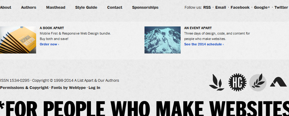
We have issues
As far as I can tell, ALA publishes two new articles once every two weeks, and groups these two articles into an ‘issue’. It᾿s very easy to navigate to the issue contents page with this convenient link. At lower browser widths, the link appears above the article title (left), but over 600px, it changes into a funky rosette and moves to the bottom corner of the main illustration (right).

In other news
Another way to navigate to each article᾿s sibling is to click on the ᾿Also in issue no 406᾿ link that appears towards the end. This is a good example of having more than one way to navigate your site. It᾿s position is also quite clever, pre-empting the reader᾿s desire to read more when they get to the end of the article.

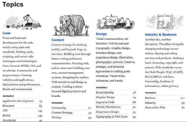
The master index
The final important way to navigate the site is to click on the ‘topics’ link in the main menu. This takes you to a page of tags grouped into superordinate categories and accompanied by the number of articles on the site that contain each tag. I think a master index like this is important for a site that publishes lots of content (100 articles a year in ALA᾿s case). The clever illustrations and descriptions of each category are also great ways for the reader to find what she᾿s looking for.
The Verdict on ALA
So, how does ALA measure up to the four criteria above? First of all, in terms of user expectations, I think the site does pretty well. The main navigation is in the most obvious possible place, and the links contained therein are ones that a general reader is most likely to need. The navigation is consistent across the whole site, including some of the more obscure admin pages (the style guide, for example, has exactly the same navigation menu as the lead article). Less important links—for example, to articles in the same issue—are sprinkled helpfully throughout each page, and although the styling of some of them is not very traditional, I᾿d say it᾿s OK because there are other, more obvious ways to get there. Lastly, links don᾿t really indicate whether they take you away from the site.
In terms of traceability, the site has many examples of good practice. The main menu at the top and secondary menu in the footer do a pretty good job of reflecting the way content is structured on the site. In the main menu, the currently selected link receives a heavy border, which helps readers to locate where they are. Each article᾿s introduction is very similar to the teaser text which appears on other navigation-oriented pages, giving all-important consistency. One thing that᾿s missing is a colour change, or other visual indication, on links that the reader has previously visited.
Skip to navigationALA seems to be an acceptably accessible website. Links are clickable, tappable and tabbable—when the screen size is large enough. The site is fully responsive, and I᾿d imagine it᾿s been tested on a range of devices. The website has a fairly flat structure, and any submenus are kept appropriately away from the main navigation. The main menu is not sticky, but it can be accessed via a fairly unobtrusive scroll or swipe to the top of the page. Links to related content are sprinkled judiciously throughout each article. Finally, off-canvas navigation is employed for small screen sizes; I don᾿t have any way to test how accessible the site really is, but I᾿ll assume it᾿s within acceptable tolerances. Also, links within the body copy have only one feature to distinguish them, colour, which isn᾿t great news for users with poor eyesight.
Finally, ALA᾿s logical navigation structure is designed to accommodate new content on a rolling basis. When new content is added, users instantly know about it, as the landing page is the issue contents page.
All in all, I᾿d say that ALA is an excellent example of a navigation system that works. It᾿s clear, consistent, and allows readers to get to the content they need with minimum fuss. I᾿m not completely convinced by the off-canvas menu at small screen sizes; it seems like a design indulgence rather than a necessity. However, ALA is run by some of the most influential people in the world of web design, so I᾿ll give them the benefit of the doubt!
Skip to navigationConclusion
For me, this has been an important exploration of the ingredients of a good navigation framework. Here are some of the lessons I᾿ve learnt:
- Be predictable. Use familiar web design structures, tell readers where they᾿re going, put the most useful navigation in the most obvious place.
- Be consistent. Make sure all the pages on your site have the same menu structure, let navigation mirror the site᾿s content.
- Be accessible. Don᾿t penalise readers for not having the right device or physical abilities.
- Be flexible. Employ navigation policies that can adapt to future content.
Choosing the right typography for a web site is probably one of the most important steps that a designer has to make, and the navigation system is a crucial part of that decision. Hopefully, from now on my websites will all have perfect navigation.
Skip to navigation
Comments
comments powered by Disqus