Content-aware styles

,
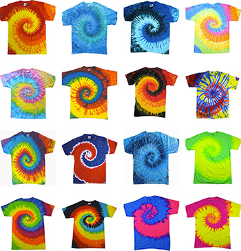
Shopping for clothes has always instilled in me a sense of dread. As I walk through the entrance to a clothes shop, worst-case scenarios flood my mind. What if I choose something that makes me look ridiculous? What if I say something weird to the sales assistants? What if I purchase something which contributes to forced labour or other unethical business practices? In order to minimise anxiety-filled shopping trips, one solution I've sometimes favoured is to find a suitable t-shirt, and then buy it in all the available colours (Figure 1). Under this logic, if one of them fits, they all should, and I won't have to go to another clothes shop for at least a year.
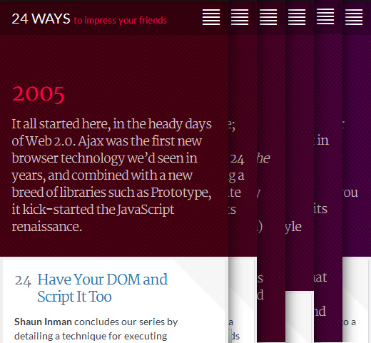
Perhaps for different reasons, 24 Ways have taken a similar approach to their website. As you may know, every year 24 Ways publishes web design-related content on each of the 24 days in December that run up to Christmas. They subtly distinguish each year by changing the colour scheme very slightly (Figure 2). Starting with a deep, reddish maroon way back in 2005, the colour scheme gradually shifts through purple towards indigo in 2020 (they've pre-defined each year's colour scheme until then). In this post, I'm interested in how this idea—using a colour scheme that varies according to the year—has been implemented on 24 Ways, and how it could be automated using a CMS (Jekyll) and Sass.
The setup
Looking at their HTML and CSS, the body tag has a class name for each year, such as .year-2015. In the stylesheet, each year has its own slightly different colour scheme, ranging from maroon to indigo:
| Sample | Year | Hex Code |
| 2005 | #66001a | |
| 2006 | #660020 | |
| 2007 | #660027 | |
| 2008 | #66002e | |
| 2009 | #660035 | |
| 2010 | #66003c | |
| 2011 | #660042 | |
| 2012 | #660049 | |
| 2013 | #660050 | |
| 2014 | #660057 | |
| 2015 | #66005e | |
| 2016 | #660064 | |
| 2017 | #610066 | |
| 2018 | #5a0066 | |
| 2019 | #530066 | |
| 2020 | #4d0066 |
Here's the CSS for last year, 2015:
.year-2015 h2 {
	color:#66005e;
}
.year-2015 .article_main .lede {
	color:#33002f;
}
.year-2015 .preface {
	background-color:#4d0046;
}
.year-2015 .banner {
	background-color:#33002f;
}
.year-2015 .nav-traverse .nav_item.nav_prev::after,
.year-2015 .nav-traverse .nav_item.nav_next::after {
	background-color:rgba(51,0,47,0.75);
	/* equivalent to background-color: #33002f; opacity: 0.75 */
}
The colours for different elements associated with a given year are the same hue, but have different luminosity and opacity. The subtle shift mirrors the gradual changes in the world of web design, all the way from old-school hacks for rounded corners in 2005 to flexbox and grid layout systems in 2015. 24 Ways is such a great archive of how the web has changed and continues to develop!
Automation with a CMS and Sass
I'd like to set up an automated version of this in my CMS. The CMS I'm going to use is the static site builder Jekyll, but this could also be done just as easily in back-end languages like PHP and Ruby. The main steps are:
- Give a date-derived class name to the
<body>tag - Use a loop in Sass to set up the styles
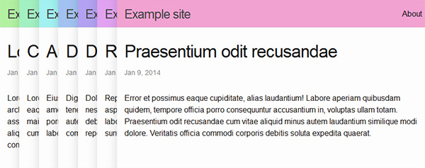
The result should look something like Figure 3:
Class names in HTML
I want each post to have a class name which is derived from the year it was posted, e.g. .year-2016. In my Jekyll project folder, I go to my _layouts and open up default.html, which contains the body tag. In the body tag, I add a Liquid variable to the class attribute which gives the date of the post, and I apply a filter so that it just spits out the year. Here's my code:
<!-- _layouts/default.html -->
<body class='year-{{ post.date || date: "%Y" }}'>
...
</body>
Sass loop
Now I want to set up the styles, and for this, I can use a @for loop in Sass. From 2005 to 2020 inclusive, there are 16 years. For my site, I'm going to use hsl colours. The values for hue range from 0 to 360, and I want to divide the colour wheel's 360 stops into 16 sections. This means each stop will be:
360 ÷ 16 = 22.5
So, 2005 will have a hue of 0, 2006 will have a hue of 23 (22.5 rounded up), 2007 will have a hue of 45 (22.5 × 2), etc. I want pastel colours, so saturation and luminosity will be set quite high. Here's the code for that:
// Sass
// For each colour stop
@for $i from 0 through 15 {
	// set up $year variable, 2005 to 2020
	$year: $i + 2005;
	// output .year-xxxx class selector
	.year-#{$year} .site-header {
		// total number of hues is 360, number of colour stops is 16
		background-color: hsl($i * 360 / 16,  74%, 79%);
	} // End .year-xxxx
} End @for
When it's compiled, the output looks like the CSS below. Note that Sass automatically converts HSL colours to the equivalent hex value.
.year-2005 .site-header { background-color: #f1a2a2; }
.year-2006 .site-header { background-color: #f1c0a2; }
.year-2007 .site-header { background-color: #f1dda2; }
...Beyond headers, colours and dates
As I sit and admire my rainbow-coloured headers, I wonder what else we could do with this. Of course, we could change different elements, and in fact, 24 Ways already changes the background colour of the whole page very subtly for each day in December. Opening paragraphs, headers, footers, anchors, blockquotes, navigation menus and semi-transparent gradients over the author's profile pic are all fair game.
We could also change different CSS properties of these elements, such as background image, size, position, shape (I've just been listening to Eva Ferreira and Jen Simmons on the Web Ahead talking about CSS shapes—well worth a listen), and even animation.
And our styles needn't hinge on the date, either. What about varying our styles according to the author or type of column on a news site, or category of product for an e-commerce site? We could even adapt styles according to how many words an article contains, the difficulty level of a tutorial, or the relative importance of an announcement on a company intranet. The possibilities are endless.
Conclusion
So many sites (including this one, currently) use the same boring old styles across all their pages. And yet, if you're using even a basic CMS, it doesn't take that much code to start being more creative with content-aware styles. I'd love to hear about examples of this that you've seen or come up with yourself. Thanks for reading!
Comments
comments powered by Disqus